レポートの最も重要な側面の1つは、レポートに含まれる情報の本質が迅速かつ簡単に視聴者に届くように、コンテンツをできるだけ目立たせることです。チャートはこの点で重要な役割を果たします。生データを提示し、データに関連するシナリオを想像することは非常に簡単ではありませんが、チャートはデータの絵画的本質を表しており、視聴者が粗データの背後にあるアイデアを非常に迅速に把握するのに役立ちます。 JavaFXには、粗いデータを絵のように美しい形式で動的に表示するためのサポートが組み込まれています。 APIには2つの側面があります。1つはAPIクラスを拡張してカスタムグラフを最初から作成するか、利用可能なグラフ固有のクラスを使用して最小限のコードでグラフを作成することができます。この記事では、JavaFXのチャートAPIの重要な側面を掘り下げ、それらを実装する方法を示します。簡単な例が提供されています。
JavaFXチャート
JavaFXチャートは、アプリケーションの他の部分と簡単に統合できるだけでなく、開発者のニーズに応じてカスタマイズできるオブジェクト指向テクノロジーの拡張可能なポリシーを取り入れています。オブジェクト指向の設計は常に拡張可能であることが意図されているため、これは新しいことではありませんが、JavaFXチャートAPIの興味深い部分は、その変更をほとんどまたはまったく行わずにインスタンス化できる既製のチャートクラスが多数あることです。プロ並みのチャートを取得するためのプロパティ。これらのチャートクラスは最も一般的でカスタマイズ可能であり、開発者のほぼすべてのニーズに適合します。ほとんどの場合、カスタムチャートを最初から作成する必要はほとんどありません。
JavaFXは、組み込み機能を備えた8種類のチャートをAPIライブラリに提供します。 JavaFXチャートAPIライブラリには多くのサポートクラスとインターフェイスがありますが、具体的な8つの実装は次のように階層的に配置されています。

図1: JavaFXチャートAPIライブラリ階層チャート
したがって、8つの一般的なタイプのグラフは次のとおりです。円グラフ 、棒グラフ 、面グラフ 、折れ線グラフ 、散布図 、バブルチャート 、積み上げ面グラフ 、および積み上げ棒グラフ 。
円グラフ
円グラフは、情報が一般的な円スライス構造でレンダリングされる一般的なグラフ形式です。各円スライスは、データの比例値を表します。 JavaFXで円グラフを作成する最も簡単な方法は、円グラフをインスタンス化することです。 クラスを作成し、次のようにデータを設定します。
PieChart pie=new PieChart();
setData()を使用して、円グラフのデータを設定できます。 タイプObservableList
PieChart.Data(String title, Double value)
円グラフを作成する簡単な例を次に示します。
package org.mano.example;

import javafx.application.Application;
import javafx.collections.FXCollections;
import javafx.collections.ObservableList;
import javafx.scene.Scene;
import javafx.scene.chart.PieChart;
import javafx.scene.layout.StackPane;
import javafx.stage.Stage;

public class Main extends Application {

   public static void main(String[] args) {
      launch(args);
   }

   @Override
   public void start(Stage stage) throws Exception {
      stage.setTitle("JavaFX Chart Demo");
      StackPane pane = new StackPane();
      pane.getChildren().add(createPieChart());
      stage.setScene(new Scene(pane, 400, 200));
      stage.show();
   }

   public PieChart createPieChart() {
      PieChart pie = new PieChart();
      ObservableList<PieChart.Data> data =
         FXCollections.observableArrayList();
      data.addAll(new PieChart.Data("Asia", 30.0),
         new PieChart.Data("Africa", 20.3),
         new PieChart.Data("North America", 16.3),
         new PieChart.Data("South America", 12.0),
         new PieChart.Data("Antartica", 8.9),
         new PieChart.Data("Europe", 6.7),
         new PieChart.Data("Australia", 5.2));

      pie.setData(data);
      pie.setTitle("The Continents: Land Area");
      return pie;
   }
}
出力
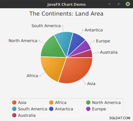
図2: 前のコードから完成した円グラフ
XYチャート
XYChart は、JavaFXのすべての2軸チャートの基礎を形成する抽象クラスです。 2軸グラフは、通常、単一の要素がペアを表し、x軸が列、y軸が行でマークされたデカルト座標領域にプロットされたグラフです。この抽象クラスの具体的な派生物は次のとおりです。BarChart 、 AreaChart 、 BubbleChart 、 LineChart 、 ScatterChart 、 StackedAreaChart 、および StackedBarChart 。 XYChartとは異なり 、円グラフ x軸とy軸の形式でデータを配置しません。これが円グラフの主な違いです およびXYChart 。 XYChartのデータ シリーズで注文されます。ただし、この一連のデータがレンダリングされる方法は、 XYChartの実装またはタイプによって異なります。 実際にインスタンス化されました。
XYChart XYChart のコンストラクターである、x軸とy軸の形式で表されます。 は次のとおりです。
XYChart(Axis<X> xAxis, Axis<Y> yAxis)
軸 Regionを拡張する抽象クラスです。 。このクラスには、 CategoryAxisと呼ばれる2つの具体的なサブクラスがあります。 およびValueAxis 。 CategoryAxis はインスタンス化されてグラフのラベルを文字列形式でレンダリングしますが、 ValueAxis Numberのデータエントリをレンダリングします フォーマット。 番号 ラッパークラスなど、Javaのすべての数値型の基本クラスを形成する抽象クラスでもあります。 Double 、整数 、フロート 、長い 、短い 、など。
棒グラフの例
棒グラフは通常、特定のカテゴリの異なるシリーズ間の相対的な違いを示すために使用されます。次の例は、Javaで作成する方法を示しています。
package org.mano.example;

import java.util.*;

import javafx.application.Application;
import javafx.collections.*;
import javafx.scene.Scene;
import javafx.scene.chart.*;
import javafx.scene.chart.XYChart.Series;
import javafx.scene.layout.StackPane;
import javafx.stage.Stage;

public class Main extends Application {

   public static void main(String[] args) {
      launch(args);
   }

   @Override
   public void start(Stage stage) throws Exception {
      stage.setTitle("JavaFX Chart Demo");
      StackPane pane = new StackPane();
      pane.getChildren().add(createBarChart());
      stage.setScene(new Scene(pane, 400, 200));
      stage.show();
   }

   public ObservableList<XYChart.Series<String, Double>>
         getDummyChartData() {
      ObservableList<XYChart.Series<String, Double>> data =
         FXCollections.observableArrayList();
      Series<String, Double> as = new Series<>();
      Series<String, Double> bs = new Series<>();
      Series<String, Double> cs = new Series<>();
      Series<String, Double> ds = new Series<>();
      Series<String, Double> es = new Series<>();
      Series<String, Double> fs = new Series<>();
      as.setName("A-Series");
      bs.setName("B-Series");
      cs.setName("C-Series");
      ds.setName("D-Series");
      es.setName("E-Series");
      fs.setName("F-Series");

      Random r = new Random();

      for (int i = 1900; i < 2017; i += 10) {

         as.getData().add(new XYChart.Data<>
         (Integer.toString(i), r.nextDouble()));
         bs.getData().add(new XYChart.Data<>
         (Integer.toString(i), r.nextDouble()));
         cs.getData().add(new XYChart.Data<>
         (Integer.toString(i), r.nextDouble()));
         ds.getData().add(new XYChart.Data<>
         (Integer.toString(i), r.nextDouble()));
         es.getData().add(new XYChart.Data<>
         (Integer.toString(i), r.nextDouble()));
         fs.getData().add(new XYChart.Data<>
         (Integer.toString(i), r.nextDouble()));
      }
      data.addAll(as, bs, cs, ds, es, fs);
      return data;
   }

   public XYChart<CategoryAxis, NumberAxis>
         createBarChart() {
      CategoryAxis xAxis = new CategoryAxis();
      NumberAxis yAxis = new NumberAxis();
      BarChart bc = new BarChart<>(xAxis, yAxis);
      bc.setData(getDummyChartData());
      bc.setTitle("Bar Chart on Random Number");
      return bc;
   }
}
出力
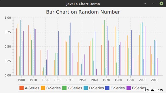
図3: 前のコードの完成した棒グラフ
ScatterChartの例
散布図のデータ項目は、XY軸の領域内の記号として表されます。以前の棒グラフコードは、次の変更を加えることで簡単に変換して散布図を作成できます。
package org.mano.example;

import java.util.*;

import javafx.application.Application;
import javafx.collections.*;
import javafx.scene.Scene;
import javafx.scene.chart.*;
import javafx.scene.chart.XYChart.Series;
import javafx.scene.layout.StackPane;
import javafx.stage.Stage;
import javafx.util.StringConverter;

public class Main extends Application {

   public static void main(String[] args) {
      launch(args);
   }

   @Override
   public void start(Stage stage) throws Exception {
      stage.setTitle("JavaFX Chart Demo");
      StackPane pane = new StackPane();
      pane.getChildren().add(createScatterChart());
      stage.setScene(new Scene(pane, 400, 200));
      stage.show();
   }

   public ObservableList<XYChart.Series<String, Double>>
         getDummyChartData() {
      // ... Same as above
   }

   public XYChart<CategoryAxis, NumberAxis>
         createScatterChart() {

      CategoryAxis xAxis = new CategoryAxis();
      NumberAxis yAxis = new NumberAxis();

      ScatterChart sc = new ScatterChart<>(xAxis, yAxis);
      sc.setData(getDummyChartData());
      sc.setTitle("Scatter chart on random data");

      return sc;
   }
}
出力
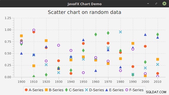
図4: 前のコードから完成した散布図
LineChartの例
ご覧のとおり、散布図のデータ項目はドットまたは記号を使用して表されています。ドットをつなぐと便利な場合があります。これにより、マークされたポイントから別のポイントへのトレンドの変化の可視性が向上します。折れ線グラフはまさにこれを行います。次の例はそのアイデアを示しています。
package org.mano.example;

// ... Import statements same as above

public class Main extends Application {

   public static void main(String[] args) {
      launch(args);
   }

   @Override
   public void start(Stage stage) throws Exception {
      stage.setTitle("JavaFX Chart Demo");
      StackPane pane = new StackPane();
      pane.getChildren().add(createLineChart());
      stage.setScene(new Scene(pane, 400, 200));
      stage.show();
   }

   public ObservableList<XYChart.Series<String, Double>>
         getDummyChartData() {

      // ... Same as above
   }

   public XYChart<CategoryAxis, NumberAxis> createLineChart() {
      CategoryAxis xAxis = new CategoryAxis();
      NumberAxis yAxis = new NumberAxis();
      LineChart lc = new LineChart<>(xAxis, yAxis);
      lc.setData(getDummyChartData());
      lc.setTitle("Line chart on random data");
      return lc;
   }
}
出力
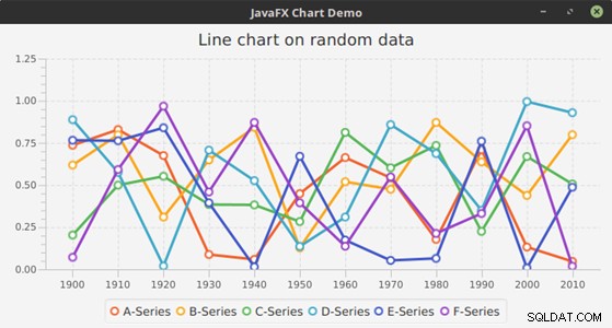
図5: 前のコードの完成した折れ線グラフ
StackedBarChartの例
StackedBarChart 棒グラフの別のバージョンです ここでは、異なるバーを並べて表す代わりに、 StackedBarChart カテゴリを別のカテゴリの上に積み重ねます。
package org.mano.example;

// ... Import statements same as above

public class Main extends Application {

   public static void main(String[] args) {
      launch(args);
   }

   @Override
   public void start(Stage stage) throws Exception {
      stage.setTitle("JavaFX Chart Demo");
      StackPane pane = new StackPane();
      pane.getChildren().add(createStackedBarChart());
      stage.setScene(new Scene(pane, 400, 200));
      stage.show();
   }

   public ObservableList<XYChart.Series<String, Double>>
         getDummyChartData() {

      // ... Same as above
   }

   public XYChart<CategoryAxis, NumberAxis>
         createStackedBarChart() {
      CategoryAxis xAxis = new CategoryAxis();
      NumberAxis yAxis = new NumberAxis();
      StackedBarChart sbc = new StackedBarChart<>(xAxis, yAxis);
      sbc.setData(getDummyChartData());
      sbc.setTitle("Stacked bar chart on random data");
      return sbc;
   }
}
出力
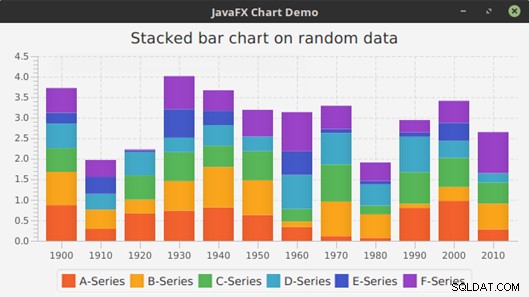
図6: 前のコードから完成した積み上げ棒グラフ
AreaChartの例
AreaChart 、ドットを結ぶ線の下の領域は、カテゴリを表すために塗りつぶされています。
package org.mano.example;

// ... Import statements same as above

public class Main extends Application {

   public static void main(String[] args) {
      launch(args);
   }

   @Override
   public void start(Stage stage) throws Exception {
      stage.setTitle("JavaFX Chart Demo");
      StackPane pane = new StackPane();
      pane.getChildren().add(createAreaChart());
      stage.setScene(new Scene(pane, 400, 200));
      stage.show();
   }

   public ObservableList<XYChart.Series<String, Double>>
      getDummyChartData() {

      // ... Same as above
   }

   public XYChart<CategoryAxis, NumberAxis> createAreaChart() {
      CategoryAxis xAxis = new CategoryAxis();
      NumberAxis yAxis = new NumberAxis();
      AreaChart ac = new AreaChart<>(xAxis, yAxis);
      ac.setData(getDummyChartData());
      ac.setTitle("Area chart on random data");
      return ac;

   }
}
出力
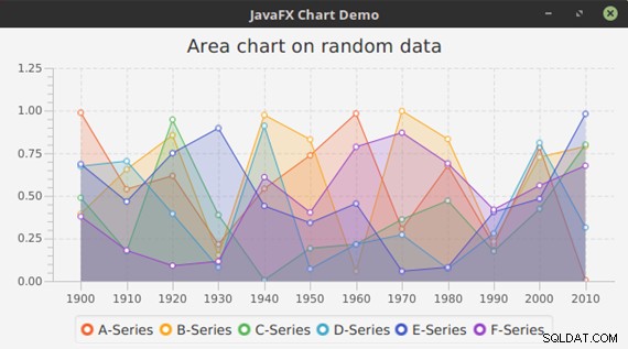
図7: 前のコードの完成した面グラフ
StackedAreaChartの例
StackedAreaChart 同じカテゴリの値の合計を表示し、 AreaChartのような個々の領域は表示しません します。これは本質的に、 AreaChartの別のバージョンです。 。
package org.mano.example;

// ... Import statements same as above

public class Main extends Application {

   public static void main(String[] args) {
      launch(args);
    }

   @Override
   public void start(Stage stage) throws Exception {
      stage.setTitle("JavaFX Chart Demo");
      StackPane pane = new StackPane();
      pane.getChildren().add(createStackedAreaChart());
      stage.setScene(new Scene(pane, 400, 200));
      stage.show();
   }

   public ObservableList<XYChart.Series<String, Double>>
         getDummyChartData() {

      // ... Same as above
   }

   public XYChart<CategoryAxis, NumberAxis> createStackedAreaChart() {
      CategoryAxis xAxis = new CategoryAxis();
      NumberAxis yAxis = new NumberAxis();
      StackedAreaChart sac = new StackedAreaChart<>(xAxis, yAxis);
      sac.setData(getDummyChartData());
      sac.setTitle("Stacked area chart on random data");
      return sac;
   }
}
出力
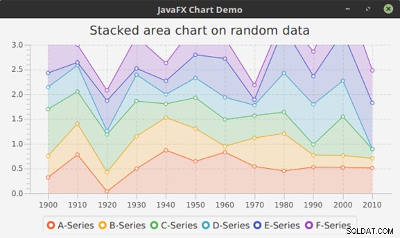
図8: 前のコードの完成した積み上げ面グラフ
BubbleChartの例
BubbleChart 系列のデータポイントのバブルをプロットします。 XYChartのこのバリエーション XYChart.Dataの追加プロパティを利用します 特別なXYChartであるという意味でのクラス XYChartのすべてのサブクラス間の実装 。ここで、データ項目は、x値、y値、およびオプションでバブルの半径を示す値などの2つまたは3つのパラメーターで示されます。これは、Javaで作成する方法を示す例です。
package org.mano.example;

import java.util.*;

import javafx.application.Application;
import javafx.collections.*;
import javafx.scene.Scene;
import javafx.scene.chart.*;
import javafx.scene.chart.XYChart.Series;
import javafx.scene.layout.StackPane;
import javafx.stage.Stage;
import javafx.util.StringConverter;

public class Main extends Application {

   public static void main(String[] args) {
      launch(args);
   }

   @Override
   public void start(Stage stage) throws Exception {
      stage.setTitle("JavaFX Chart Demo");
      StackPane pane = new StackPane();
      pane.getChildren().add(createBubbleChart());
      stage.setScene(new Scene(pane, 400, 200));
      stage.show();
   }

   public ObservableList<XYChart.Series<Integer, Double>>
   getDummyChartData2() {
      ObservableList<XYChart.Series<Integer, Double>> data =
         FXCollections.observableArrayList();

      Series<Integer, Double> as = new Series<>();
      Series<Integer, Double> bs = new Series<>();
      Series<Integer, Double> cs = new Series<>();
      Series<Integer, Double> ds = new Series<>();
      Series<Integer, Double> es = new Series<>();
      Series<Integer, Double> fs = new Series<>();
      as.setName("A-Series");
      bs.setName("B-Series");
      cs.setName("C-Series");
      ds.setName("D-Series");
      es.setName("E-Series");
      fs.setName("F-Series");

      Random r = new Random();

      for (int i = 1900; i < 2017; i += 10) {
         double d = r.nextDouble();

         as.getData().add(new XYChart.Data<>
         (i, r.nextInt(32)+r.nextDouble(), 2 * d));
         bs.getData().add(new XYChart.Data<>
         (i,r.nextInt(32)+r.nextDouble(), 4 * d));
         cs.getData().add(new XYChart.Data<>
         (i,r.nextInt(32)+r.nextDouble(), 3 * d));
         ds.getData().add(new XYChart.Data<>
         (i,r.nextInt(32)+r.nextDouble(), 5 * d));
         es.getData().add(new XYChart.Data<>
         (i,r.nextInt(32)+r.nextDouble(), 1.5 * d));
         fs.getData().add(new XYChart.Data<>
         (i,r.nextInt(32)+r.nextDouble(), 1.7 * d));

      }

      data.addAll(as, bs, cs, ds, es, fs);
      return data;
   }

   public BubbleChart<Number, Number> createBubbleChart() {
      NumberAxis xAxis = new NumberAxis();
      NumberAxis yAxis = new NumberAxis();
      yAxis.setAutoRanging(false);
      yAxis.setLowerBound(0);
      yAxis.setUpperBound(30);

      xAxis.setAutoRanging(false);
      xAxis.setLowerBound(1900);
      xAxis.setUpperBound(2017);
      xAxis.setTickUnit(10);
      xAxis.setTickLabelFormatter(new StringConverter<Number>() {

         @Override
         public String toString(Number object) {
            return String.valueOf(object.intValue() / 10);
         }

         @Override
         public Number fromString(String string) {
            return Integer.valueOf(string) * 10;
         }
      });

      BubbleChart blc = new BubbleChart<>(xAxis, yAxis);
      blc.setData(getDummyChartData2());
      blc.setTitle("Bubble chart on random data");
      return blc;
   }
}
出力
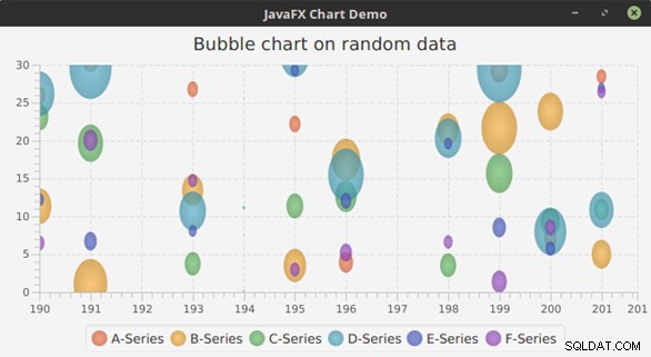
図9: 前のコードから完成したバブルチャート
結論
カスケードスタイルシート(CSS)を使用して、配色の変更、凡例と軸またはグラフ記号の変更など、JavaFXグラフのデフォルトの外観を変更できます。 JavaFXは、これを実現するために多くのチャート固有のCSSタグを提供します。 JavaFXチャートAPIの最も重要な部分は、すぐに使用できるチャートタイプのさまざまなバリエーションを提供することです。データレポートスキームに最適な適切な種類のグラフを選択するのは開発者の責任です。